
How to Choose the Right Colour Scheme (That You Won’t Get Bored Of)
How do you choose a colour scheme that stands the test of time?
As we move further into winter, many homeowners start thinking about refreshing their interiors - and colour is usually the first place the conversation begins.
But choosing the right colour scheme isn’t just about selecting a shade you like. It’s about how that colour behaves in your space, how it responds to light, and how it works alongside everything else in your home. The most successful schemes are the ones that feel balanced, considered and easy to live with - not overwhelming or led by trends.
This guide shares the exact principles we use when helping clients choose colour palettes that feel right now, and still feel right years down the line.
Who This article Is For?
This guide is ideal for homeowners who want to refresh their interiors but feel unsure about colour - particularly those worried about making a choice they’ll tire of quickly.

Key Takeaways
Start with how you want the room to feel, not a specific colour
Always test colours in real light throughout the day
Build your palette around existing features you already love
Mixing warm and cool tones creates balance and depth
Carry colour subtly through your home to create flow and cohesion
Why Colour Choice Matters More Than You Think
Colour has a huge influence on how a space feels.
It affects mood, comfort and even how large or calm a room appears. In winter, when we rely more on artificial lighting and spend more time indoors, the wrong colour can feel flat, cold or overpowering - while the right one can completely transform how welcoming a space feels.
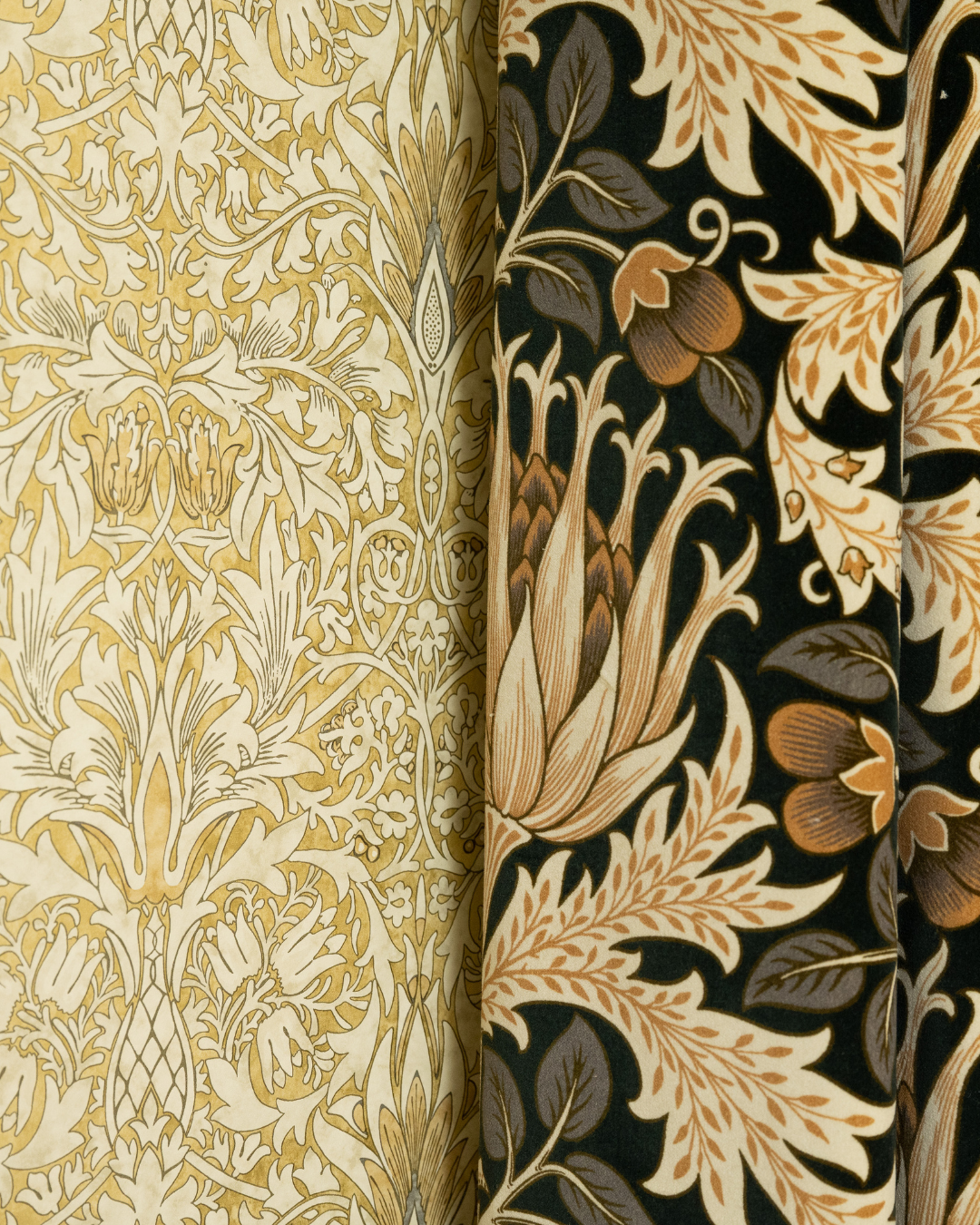
This is why we always approach colour strategically, rather than treating it as a final decorative decision, often working with design-led paint collections such as Little Greene and Paint & Paper Library, which are known for their depth, subtle undertones and longevity.
Start With How You Want the Room to Feel
Before looking at paint charts, ask yourself how you want the room to feel when you walk into it.
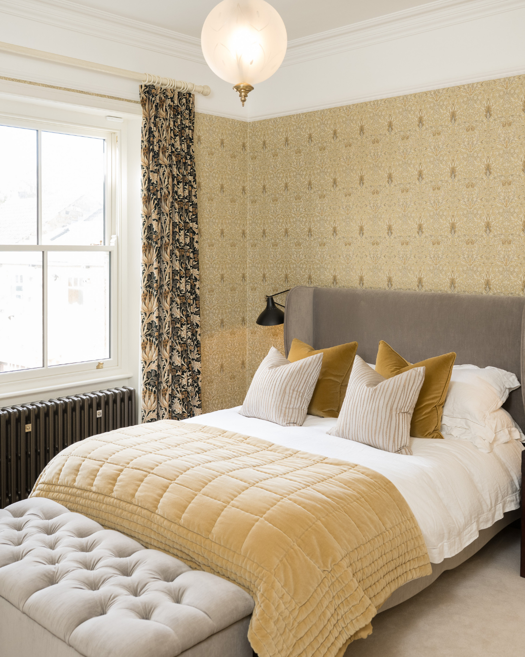
If you’re aiming for something calm and restorative, warmer neutrals, soft greens or muted tones tend to work beautifully. If you want a room to feel cosy and energising, deeper shades such as berry tones, rusts or warm clays can add depth without overwhelming the space.
Once the feeling is clear, every other decision becomes much easier.
Test Colours in Real Light (Not on Your Phone)
Colour can look completely different depending on light.
A shade that feels perfect on your phone or in a showroom can shift dramatically once it’s on your wall. We always recommend painting large test swatches, painting 2 coats to get the real depth of colour, and then observing them at different times of day - morning, afternoon and evening - and especially under lamplight, which is when most rooms are actually used during winter.
This step alone prevents many costly mistakes.
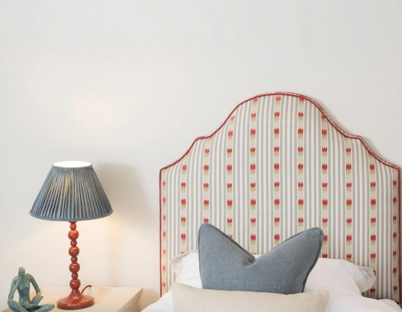
Build Your Palette From Fixed Features
One of the most common mistakes we see is choosing paint colours first.
If you already have flooring, furniture, worktops or window dressings you love, these should lead the palette. Pulling tones from existing elements creates a scheme that feels natural and intentional, rather than forced.
This approach also helps ensure longevity, as the palette is grounded in pieces you’re already committed to.
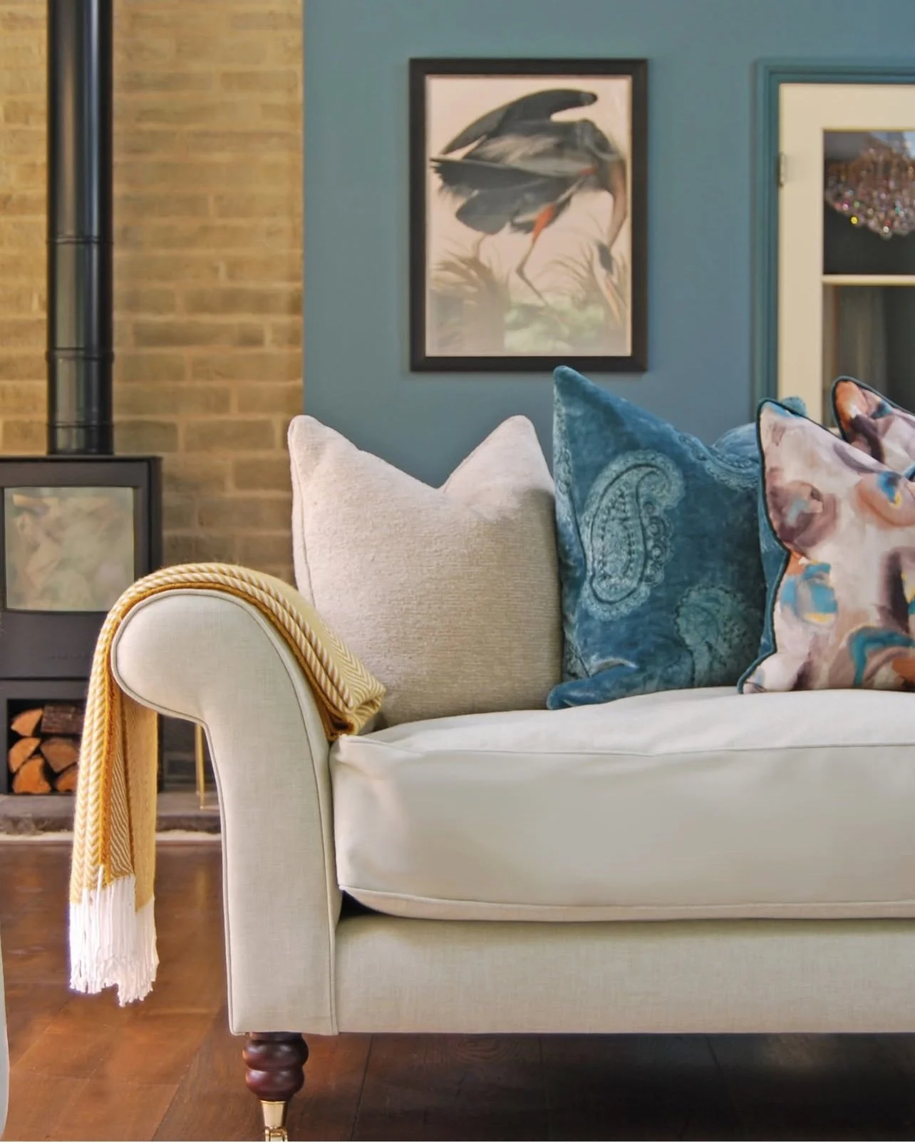
Mix Warm and Cool Tones for Balance
Balance is key to a colour scheme that doesn’t feel tiring.
Too many cool shades can make a room feel flat or uninviting, while an all-warm palette can quickly feel heavy. A thoughtful mix of warm and cool tones adds dimension and creates a space that feels layered and liveable.
This balance often happens subtly - through textures, fabrics and finishes rather than bold contrasts.
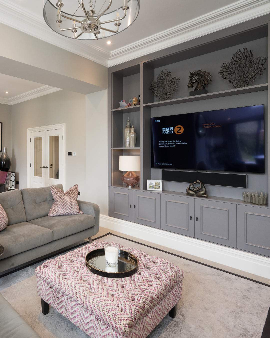
Think About the Flow of Your Home
Colour shouldn’t stop at one room.
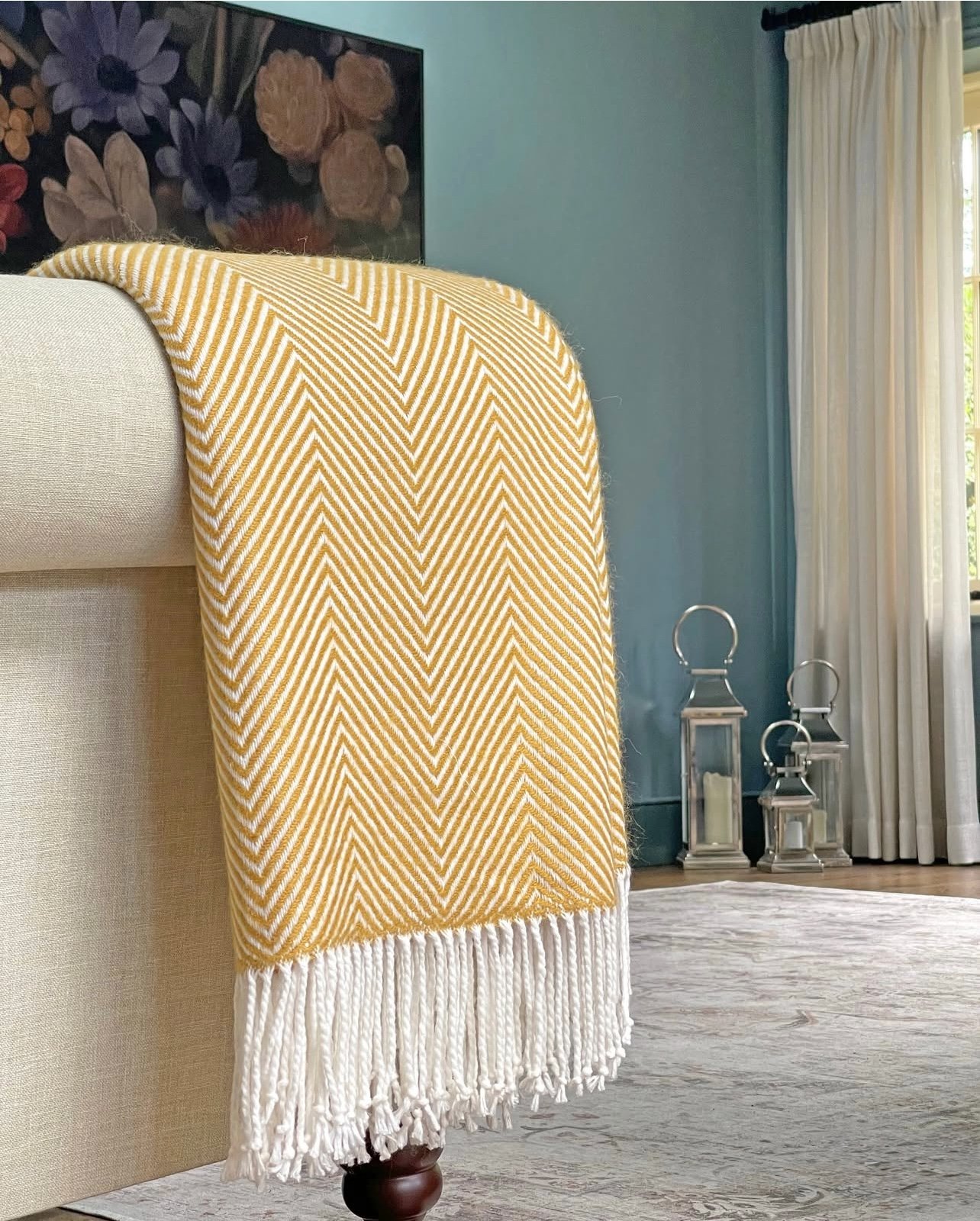
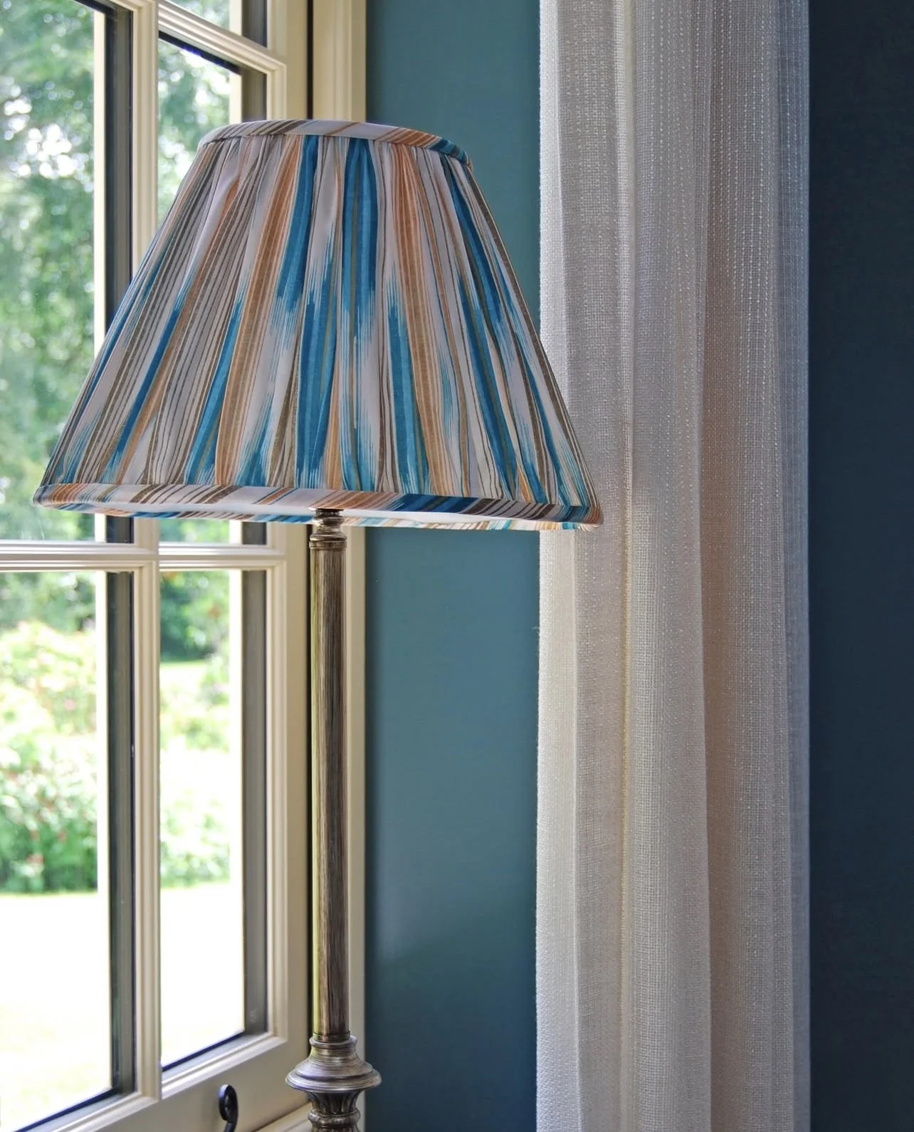
In open-plan spaces or adjoining rooms, carrying key tones through the home helps everything feel connected. This doesn’t mean repeating the same colour everywhere - often it’s a gentle echo through cushions, lampshades, artwork or accessories that creates cohesion.
When the flow works, the entire home feels calmer and more considered.
Colour Mistakes to Avoid
Some common pitfalls include:
Choosing colours in isolation without considering light
Following trends too closely without thinking long-term
Using too many unrelated tones, which can feel chaotic
Ignoring how colours transition between rooms
With a clear plan, these mistakes are easy to avoid - and the results feel effortless rather than overdesigned.
FAQ’S
-
Focus on balance, subtlety and how the colours make you feel rather than bold trends.
-
Not necessarily. Cohesion across rooms often creates a calmer, more timeless result.
-
Yes - when used thoughtfully, deeper tones can feel incredibly warm and inviting.

Ready to Choose a Colour Scheme That Truly Works?
If you’re ready to refresh your home but aren’t sure where to start, our designers can help you pull everything together - from paint colours and fabrics to finishes that work beautifully with your light and layout.
You can book a Discovery Appointment, or call 01937 581451 (visits by appointment only).